
We were given a series of questions and were told to choose our favourite image at the Street Level Photoworks exhibition – Future Proof.
My chosen image is “Love Me Tinder #1” by Ryan Mccann.
1. The image was presumably taken on a digital camera. It does not affect my reading of the work.
2. When I first looked at the photograph, I was instantly drawn to the young man sitting at the bar. I was interested in how he was sitting, alone a the bar with nobody around him, on his phone. Then once I looked further, I saw the girl coming in the door. I was instantly drawn to the image because of the colours and the layout.
3. The image is landscape.
4. The main focus, the bar, is more to the left side of the image. On the right, the girl walking into the bar is the focus on the opposite side of the image.
5. Only a section of the bar is included in the frame of the image. By doing this, the photographer is telling us that the two characters are the main focus of the image.
6. The photographers view point is equal to the subject. By doing this, it gives an intimate feel to the image, as if we are getting a close up view of something private.
7. I feel like before the image was taken, if it were happening in real life, the guy would have been sitting on his own looking at his phone, and the girl would have also been focused on her phone as she walked in the door.
8. In the image, it appears to be the lights from the bar itself illuminating the scene. If you look closer though, there is a sort of halo light shining down on just the two main characters in the image. This creates a natural mood, but also tells us where the main focus is, as though it highlights the male at the bar and the female at the door.
9. The image is very clearly in colour. The first thing that drew me into the image was how bright and colourful it is, how much is going on but how simple it is at the same time. I feel like if the image was in black and white, it wouldn’t have the same feel to it and it wouldn’t jump out as much as it does.
10. The scale of the work is large and dominating.
11. The work was hung on the wall and printed on a canvas. I felt like the image was bright and interesting enough that by presenting it in a simple manner was more effective at getting the attention of people.
12. The work is titled “Love Me Tinder #1”. I feel like the title explains a lot about the image and the story behind it. I wouldn’t change the name, because it clearly explains the image.
13. I think the image was made by someone trying to make a point on technology, and it’s effect on people in this day and age.
14. I definitely think the artist has successfully put across their point, as the image highlights how reliant people have become on technology.
15. The image makes me think about how technology has taken over so many things, even something as simple as going on a date, and the whole concept intrigues me.
16. I like the work as the concept of the whole image makes you think about more than just two people at a bar, and that it has a deeper meaning.

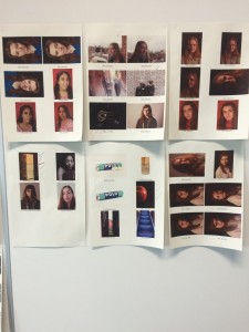
 te and print out contact sheets of some of our best/favourite work. We created our contact sheets using Photoshop, and printed them out using the printers in the college library. Once we had out sheets, we put them up on the wall for the rest of the class to see. The class then went around the room looking at everyone’s work, and ticked off their favourite image from each person. After everyone had seen all the work, we had a class discussion about why we ticked off then images we did, and started to think about what images we should think about putting in out portfolio.