Post Production Evaluations

As part of our portfolio creating unit, we had the task of shooting and printing 6 more images for our portfolio. To do this, we worked from our previously created Portfolio Plan – an Adobe Spark page for use as a guideline for our shots.


CCIM
Portfolio Image  – Shot by Diana Ferguson (my own work)

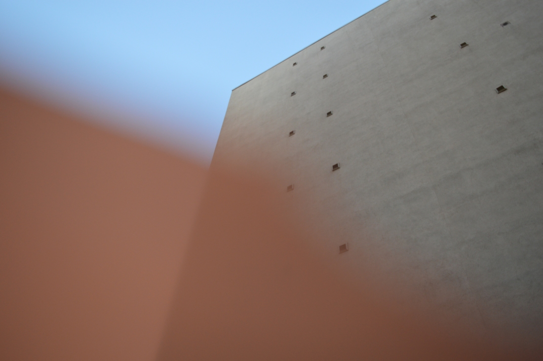
This portfolio image (above) was created with the use of filters with inspiration taken from my portfolio research. I used a handmade filter for this image and found that it showed contrast against the blue sky. To change this image and make it brighter, I opened it on Photoshop so that I was able to create layers that allowed me to play around with the colours. I brightened the blue and orange areas of the image and also left the building slightly darker than in the original image. I feel that in doing this, I created a more vibrant image that accentuated the original colours. Once I finished adjusting my image, I then embedded it onto a previously sized canvas ready for printing.


PortfolioTemp
Portfolio Image – Shot by Diana Ferguson (my own work)

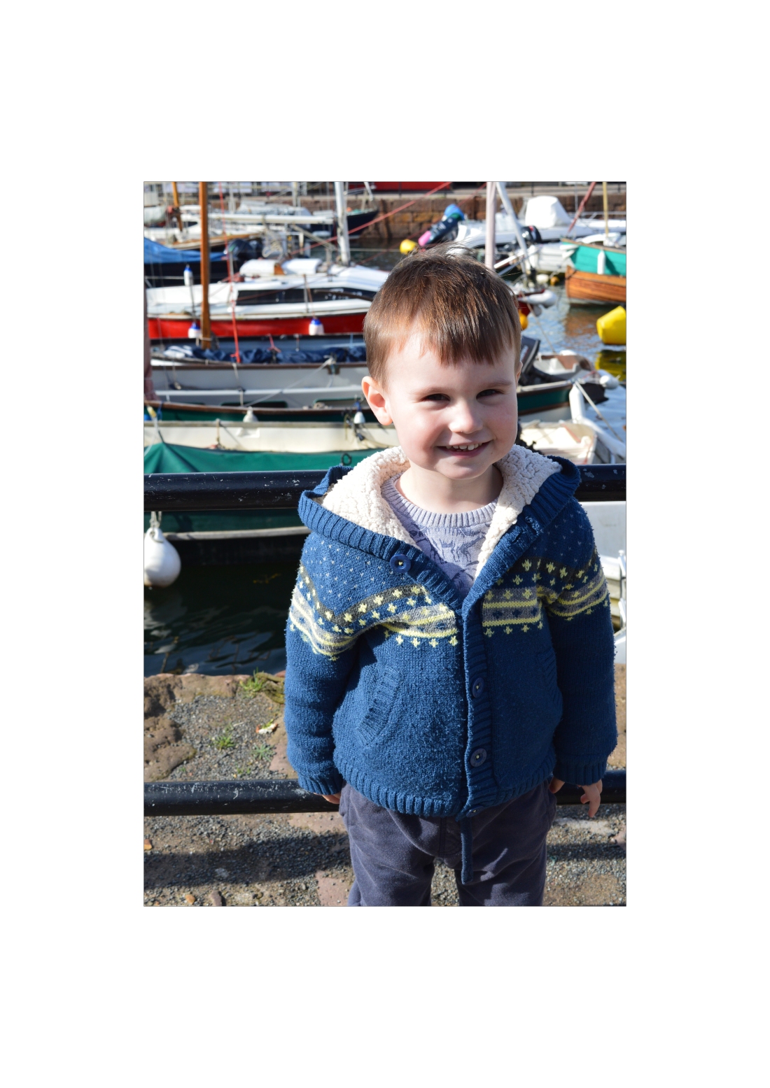
This image (above) is my harbour portrait and was taken using natural light. The main adjustments I made were changes to the exposure, shadows, highlights and white balance. To make these adjustments I opened my image on Photoshop and worked from there. Once I finished adjusting my image, I then embedded it onto a previously sized canvas ready for printing. I really like this image as it links my theme of home back to my portraits, and also ads diversity to my portfolio as it is a location portrait.


PortfolioTemp2
Portfolio Image – Shot by Diana Ferguson (my own image)

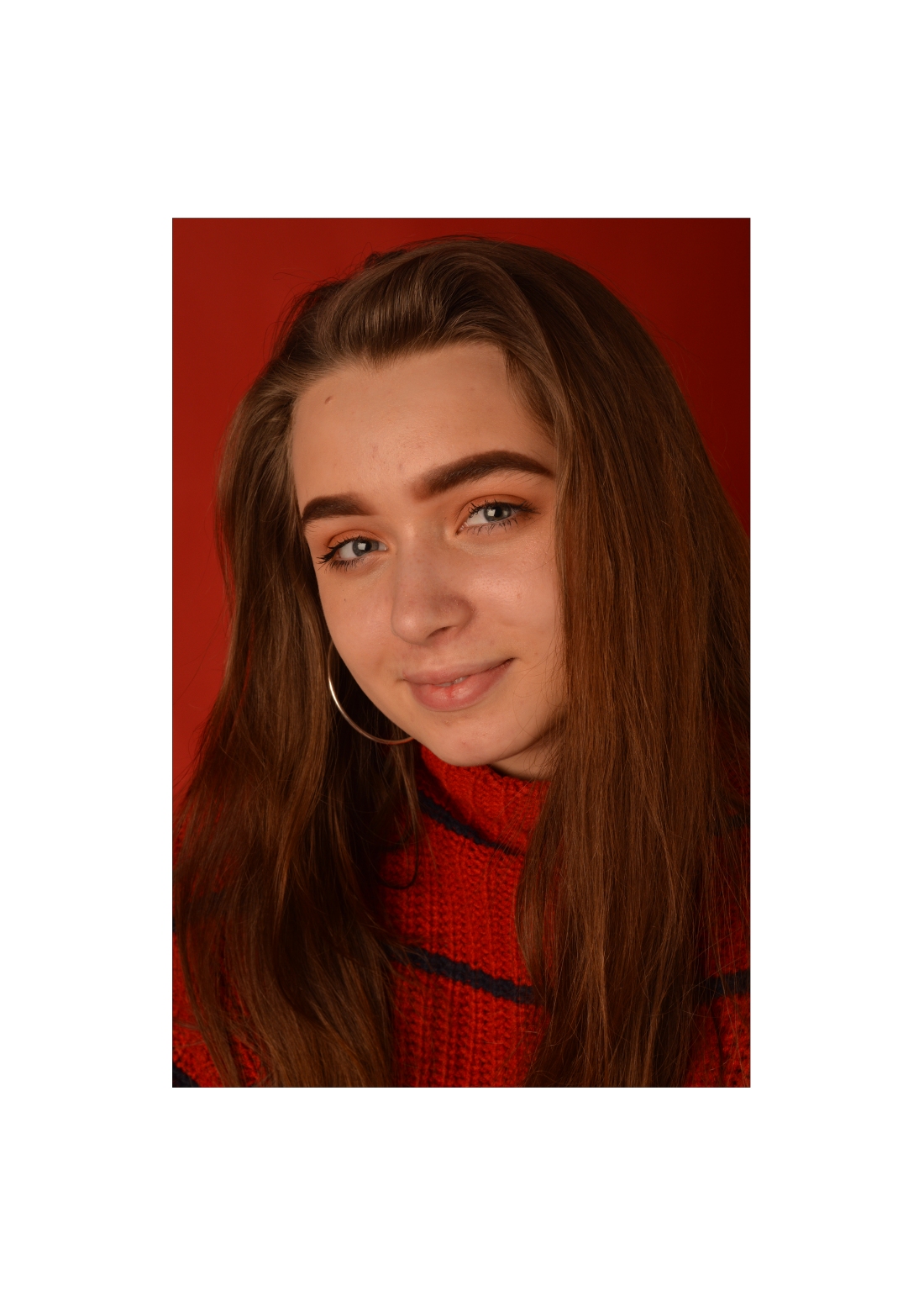
My next image (above) is one of my two studio portraits. This portrait is based around the theme of ‘Red’.  To achieve this image I had my model (who was wearing red) to sit in front of a red background. When making adjustments to this image, I tried to keep it to a minimum as I was really pleased with how the image originally turned out. I adjusted the exposure slightly along side the shadows and highlights. Once I finished adjusting my image, I then embedded it onto a previously sized canvas ready for printing. I am extremely happy with how this image turned out as it really highlights my theme and showcases the natural beauty of an image that hasn’t been overly edited.


PortfolioTemp3
Portfolio Image – Shot by Diana Ferguson (my own image)

This image (above) was shot at the harbour and was to be focused mainly on the hut in the centre of the image. For this, I cropped the image slightly using Photoshop to make sure the hut was in the centre. I also changed the exposure slightly and adjusted the colours so that the red became slightly more vibrant, the blue of the sky popped and sharpened it so that the rocks at the bottom of the image were more prominent. Once I finished adjusting my image, I then embedded it onto a previously sized canvas ready for printing. I feel like this image captures my theme of home well as it was shot in my home town and highlights something close to my heart.

Robyn
Portfolio Image – Shot by Diana Ferguson (my own image)

For my second studio portrait (above), the aim was to create a moody feel to it. This image was taken in studio using side lighting to light only one side of my models face. When making adjustments to this image, I first changed the colour of the background to a grey tone, then changed the exposure slightly. I then adjusted the highlights and darkened the shadows to highlight the exposed side of her face. Once I finished adjusting my image, I then embedded it onto a previously sized canvas ready for printing. I feel like the side lighting really helped create my desired moody feel to the image and think it is a very good technique to use when creating atmospheric images.


Gold
Portfolio Image – Shot by Diana Ferguson (my own image)

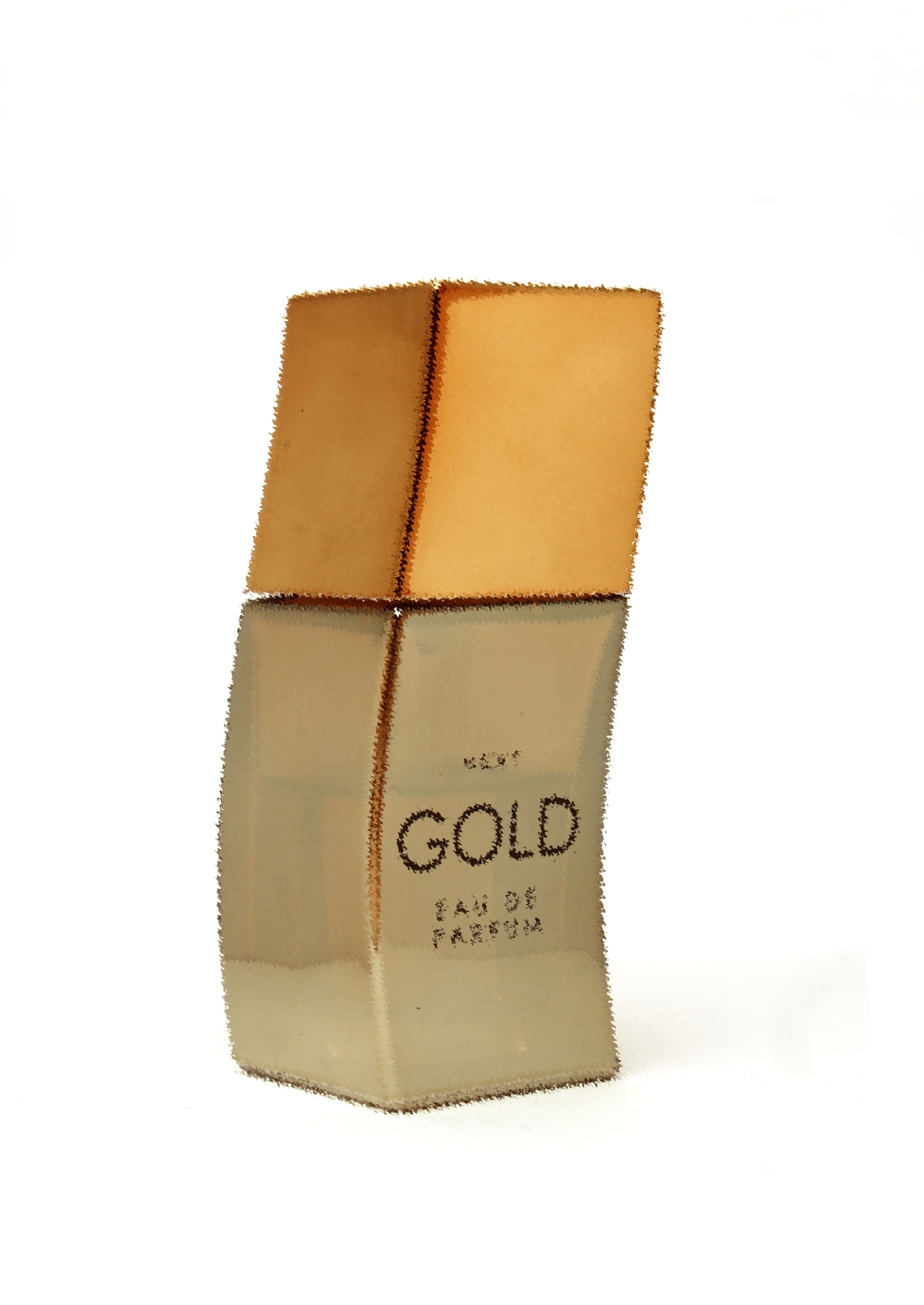
For my final portfolio image (above), I shot a still life image. This image was taken in studio on a piece of white card and a soft box. When adjusting this image I worked on the exposure slightly, and also the highlights. As well as that, I changed the background colour slightly just to make the white more vibrant than what it originally looked like. Once I finished adjusting my image, I then embedded it onto a previously sized canvas ready for printing. I think this image came out really clean and am very happy with the finished product.

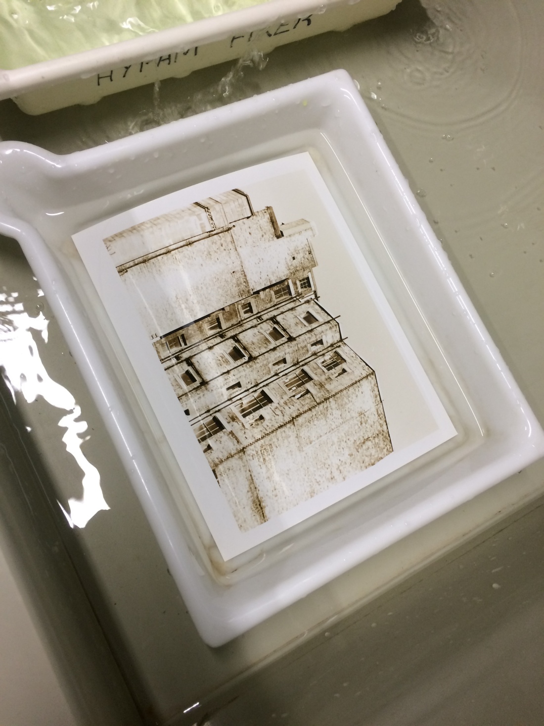
To get my images printed, I used Deadly Digital and printed on Permajet Gloss paper and I am extremely pleased with the appearance of my images after the retouching process. When creating the canvas for my images next time, I feel like I could resize the borders slightly better to fit my images. Over all, the process as a whole worked well for me and I enjoyed doing it.

Portfolio Evaluation

How effective was your choice of images and the retouching techniques used in your images? Why?

I think my choice of images were effective in highlighting my skills as a photographer. My images cover a range of subjects and techniques in studio and on location. It shows my capability of shooting portraits, still life, candid and creative images along with many others.  They also show an insight to my life in regards to the people in it and the places I have been. When retouching my images, I usually tent to stick to the basics unless I intend to make obvious changes. I usually focus on adjusting the exposure if needed, along with the white balance and colour balance. I sometimes adjust the highlights and shadows slightly if I want to highlight or darken certain aspects of my images. I find these techniques extremely useful as even the slightest change can affect an image as a whole, and I enjoy touching up my images to their full potential.

How effective was your choice of presentation and layout options in creating visual impact and why?

I chose to make my portfolio as enticing as possible. I decided to do this by having the first 6 images in my portfolio darker than the others, using my best images first then moving down the line of my favourite shots. All of my first 6 images have dark backgrounds, which I feel creates a dramatic feel to my portfolio. I decided to link my dark and light prints by a common theme, which was still life. My last dark image is an object still life image, linking to the first light image which is my product still life. I then progressed through to a more homely theme, including images of where I currently live and then on to when I originally come from. I rounded up my portfolio with some more portraits, tying to the theme of home with a portrait of my brother at the harbour where I come from and moving to some studio shot portraits. I feel that my choice of prints and the order that they are in achieves my goal of an enticing portfolio while showing an insight into my personal life.

How effective was your choice of print process used? Why?

My images were printed at Deadly Digital and I chose to get my images printed on Permajet Gloss paper. This choice was purely made on the cost of the paper as I was on a tight budget and didn’t have much leeway with how much money I could spend. I decided to go for Gloss as it was what I was used to and wasn’t entirely sure how the other paper types would look.  I think in the future I will go for a more adventurous paper time, something like Hahnemuhle German Etching or Brilliant Satin Matte White. I am still very happy with how my prints look on the Permajet Gloss paper type.

How would you improve on any of the many steps/choices you made in retouching, layout and printing of your images?

I think in the future I will start spending more time retouching my images and using more of the techniques I have learned throughout this year, also working more on my borders and the sizing of my images on the canvas. I would like to work on widening my variety of images and finding subjects that flow together to possibly try and add two pictures onto one page. I will definitely stick with getting my images printed at Deadly Digital as they have a wide variety of printing and paper types for reasonable prices.

Introduction to Colour Management

Colour Space – 

What is Colour Space?

Colour Space is an abstract mathematical model which describes the range of colours, showing the amount of colours used.


Colour Range


Bigger colour spaces such as Adobe RGB capture a wider variety of colours compared to smaller colour spaces like sRGB.


Colorspaces2


Why do we need it?

It is a standard that sets a specific colour range. This allows us to see what the camera can pick up, what monitors can display and the range a printer can print.

When would you use Adobe98 or sRGB?

Each colour space has a different range of tones and colours. Depending on what colour space you use, it can affect the vibrancy and brightness of your colours.


RGB2


Shown above is a comparison between sRGB and AdobeRGB. There is a clear difference between each, sRGB showing more muted and toned down colours compared the the brighter, vibrant colours of AdobeRGB. There is a wider variety of tone available with AdobeRGB than there is with sRGB.

When shooting in AdobeRGB, it is a possible option to convert the image to sRGB without loosing the colours from the photograph. When shooting in sRGB though, it is not possible to convert to AdobeRGB without the loss of colours.

AdobeRGB is specifically good to shoot in for people who regularly print their images. Printers are adapting to the AdobeRGB colour space and leave the printed images looking more vibrant and colourful.


Colour Profiles –

What is a colour profile?

Colour profiles come in to play when it comes to monitors displaying the images. Using RGB when shooting means that you can capture millions of colours. 16.7 million to be exact.

Colour profiles determine what colours are actually shown on monitors, as they are not able to display the full spectrum of colours, and helps provide consistency between different devices.

When would you use a colour profile?

Colour profiles are used in softwares such as Photoshop and Lightroom to help keep consistency through the whole process of shooting, editing and printing.

Emulate and Create Evaluations

19th Century – In The Beginning

I think the final image as a whole worked really well. My chosen portrait worked perfectly with the Tin Type effect and I feel like it came out looking almost authentic.

I found the tutorial steps particularly easy to follow and were explained well enough for me to successfully recreate the effect.

I found the hardest part to be navigating my way around Photoshop. The tools needed to create the image weren’t made overly clear. I think the solution to this would be to practice using Photoshop more to create these types of images.

I would definitely use this skill in the future and would particularly like to try and do a series of portraits in this style. I could possible shoot my portraits in a more fitting setting and have my models styled to fit the Tin Type look and feel.


20th Century – Film Types and Formats

I think I achieved the film type effect well in this image. The changed made to the image really brought out the colours in the photograph, specifically the blue.

The hardest part of the process for me was following the tutorial. I found the tutorial slightly complicated and I struggled to follow some of the steps, particularly changing the levels of Layers A and B.

If I were to work with Fujichrome Velvia 50 again, I think I would prefer to shoot with Fujochrome Velvia 50 and get an authentic image rather than a digitally created one. I feel like the authentic images have more of a natural beauty to them, and I also enjoy the process of shooting in film rather than editing on Photoshop.


21st Century – Digital Manipulation Photoshop Techniques

For me, I personally found that my original Filters image came out extremely well. The contrast of the orange paper and blue sky is very eye catching. The editing process brought out the contrast of the colours even more, giving it an even stronger look.

I feel like I could have spent more time focusing on brightening the building more, as I focused mainly on the orange and blue colours instead of the image as a whole.

The use of filters is an extremely interesting technique and is a good basis for Digital Manipulation as it involves bright colours that are perfect for brightening in Photoshop. I would enjoy doing a project on manipulating Filter images on Photoshop as it gives you a wide variety to work on and edit.

Film Formats and their Characteristics

For this imaging class, we were able to have a look at some old cameras that were brought in for us. We had a class discussion about how they work, and the processes used for each camera, including the film types.

35 mm (small format) –

35m
35 mm Film Camera

The 35 mm ( 24 mm x 36 mm ) film is the most commonly used film for still life chemical photography and motion pictures.

It was created by Osker Barnack when he doubled the usual cinema format ( 24 mm x 18 mm ).

There are usually 12, 24 or 36 exposures in each film roll depending on what one you choose.

Some examples of 35 mm films are listed below;

  • Ilford FP4 35
  • Ilford HP5 35
  • Fuji Fujicolour C200 35
  • Kodak T-Max 100 35
  • Cinestill 800 ISO 800t Tungsten Xpro 35


120 mm (medium format) –

120mm
120 mm Film Camera

120 mm film is popularly and widely used for still photography, and was introduced in 1901 by Kodak.

This type of film was originally held on a wooden spool with metal flanges, then progressed to all metal. It is now made fully from plastic.

The length of film is between 30 inches and 33 inches.

Some examples of 120 mm film is listed below;

  • Fujifilm PRO 400H 120
  • Ilford FP4 Plus 120
  • Fujifilm Fujichrome Provia 100f 120
  • Ilford XP2 Super 120
  • Ilford Delta 400 Pro 120
  • Ilford Pan F Plus 120


Large Format – 

Large Format
Large Format Camera


These types of cameras are some of the earliest devices used to take photographs.

Large format film is anything above 4 x 5 inches (102 mm x 127 mm).

In the 1930s to 1950s, the most common size of large format film was 4 x 5 inches.

Large format film takes a longer time to use as film loading and unloading must be done in a dark space. This is usually done in a darkroom or changing bag.

Large format was widely used in press photography.

Some examples of large format films are listed below;

  • Ilford FP4 Plus 4 x 5
  • Ilford Delta 100 Profesional 4 x 5
  • Kodak Ektar 100 4 x 5

Portfolio Building

This task was a was for us to choose what images to use for our portfolio.

We were given the task to select 40 of our best images and create a folder including the images.


Once we had created our folders, we then put them onto contact sheets using Photoshop. Once the contact sheets had been created, they were printed off and taken to class where we stuck them up on the wall for the class to view and select their favourites.

PBProof


Above is a picture of all my contact sheets up on the wall.

As a class, we went around and looked at everybody’s sheets one at a time, marking off the ones we liked the best. We also had a group discussion about what we would ideally like to include in our portfolios.

Once we had chosen our favourite images, we then sent them away to be printed so that we could see physical copies of our work.


After that, we were able to select our favourite 6-8 images to prepare for our portfolio.

Creative Image Making Techniques

For this brief, we were given the task to portray the theme of Home through a series of images that use different creative image making techniques.

For the Creative Camera Technique, I started with zooming. This also included the use of shutter speeds and blurring. To achieve my images, I chose subjects in and around where I live. I tested multiple ways of moving the camera, including zooming in and out, panning, moving the camera up and down, and twisting it.

I found it strange to move the camera around as I was shooting as it goes against what I usually do, but the results are interesting to look at. I enjoyed experimenting with how my images looked and I think that the technique can make any normal subject look interesting.

CCT7CCT6CCT5CCT4

The next technique I tried out was the use of special effect filters. Instead of using acetate sheets, I coloured cut up bits of clingfilm using coloured pens. I then shot my images, putting different colours in front of the lens. I was also able to layer the colours to create a different look each time.

I really enjoyed this technique, as it created a unique feel to my images.

CCT4CCT3CCT2CCT1

For the Darkroom Techniques, I decided to focus mainly on pseudo-solarisation. Instead of doing this the traditional way, in a darkroom, I created my images using Photoshop.

To create my images, I first selected two photographs in the theme of Home that I thought would work well.

Once I had my images, I opened them up in Photoshop. The first step was to convert the image to black and white. I done this by opening the Layer tab > New Adjustment Layer > Hue and Saturation. This then allowed me to move the saturation slider all the way to the the left, removing all colours in the image. The next step was to then open up a new layer by going to Layer > New Adjustment Layer > Curves. This then allowed me to ‘draw’ an inverted V on the pallet, which in turn gave me the base of my pseudo-solarisation image. All that was left to do was adjust the images slightly until I was happy with them.

I really enjoyed using this method and found myself very happy with how my final images turned out.

Solarisation DT1Solarisation DT2

Another Darkroom technique that I tried was Toning. I done this the traditional way, using one of my own darkroom prints and a toning bath.

To tone my print, the first step was to wash it in a water bath for around 10 minutes. Once my print was washed, I then placed it in a bath of “blue toner” for around another 10 minutes, making sure I used gloves when keeping it from floating to the top. When I was happy with the colour of the image, it was taken out of the toner and put back into the water bath to wash the excess off. I lightly cleaned the border of my print by rubbing it until it was as white as possible. After the cleaning process, it was then left to dry.

I found it very satisfying to tone my print, as the finished print had a lovely blue colour to it that made the image pop. I would use this technique in the future, as it is extremely rewarding.

IMG_6780IMG_6781IMG_6783

For the mixed media and digital techniques, I created three images. The first image was created using digital layers and the use of texture screens. First I selected my main image, then a texture image to be layered on. I them put the image and texture onto the same document in Photoshop. This was simply done by pasting the texture onto my image. This resulted in the texture becoming a layer. I then adjusted the size of the texture to fit over my image. Once the layer was created, I blended the two layers using the Blend Mode option, and decided what on fit best with my desired look. I then desaturated the colour from the texture layer. Then all that was left to do was adjust the opacity of the texture, and make any more final adjustments.

I found this method interesting to try and create, but rewarding when the final image was created.

Screen Shot 2018-06-07 at 09.55.31

TextureSceen.jpg

The second image was created using Image Distortion. The first step was to select an image that best fit, then I opened it in Photoshop.

Distorting the image was fairly simple. All that I needed to do was to select the Lens Correction Tool. I then went to Edit > Transform. From there, I was able to choose multiple options; Free / Skew / Perspective / Rotate /Warp / Puppet Warp. I played about with how I wanted my image to look until I was happy with it.

I found this technique fun to do, as it gave me a lot of freedom. I’m very pleased with how my final image turned out.

Screen Shot 2018-06-07 at 09.45.18

Distortion

The last technique I used was Double Exposure. To do this, I selected a portrait with a white background and opened it in Photoshop. The next step was to cut out the figure using the pen tool. I created a new blank A4 landscape canvas and pasted my cut out figure onto it. Once I had my base, the next step was to select a background image to merge with my portrait. When I found my image, I then pasted it onto my portrait and resized it to fit. All that was left to do was to change the option to Overlay and change the opacity of the background.

I found this one of the more challenging techniques, but very rewarding as the final image turned out reeky well.

Screen Shot 2018-06-07 at 10.15.17Screen Shot 2018-06-07 at 10.18.21

DE.jpg


Contact Sheet 1:

ContactSheet-001


Contact Sheet 2:

ContactSheet-002

Typology:

Topilogical